Showing posts with label Final Responses. Show all posts

12.5.13

SPATIAL // PROJECT III, FINAL

Meditation has long served humanity as a way to achieve consciousness, an opportunity to self-reflect, and a moment to relieve stress, shed the world, and be still, even if its only for a slight moment. When thinking of a fast-paced, business driven location, New York City seemed like the perfect domestic place to serve as a strong juxtaposition for Meta, a monument to meditation. The big apple has long been a symbol of the United States and has become the epitome of an urban jungle. The experience a patron will go through is one of serenity and self-reflection through the architecture, lighting, and sound of the monument.


8.4.13

SPATIAL // PERSUASIVE FINAL


Dieter Rams was a minimalist. He strived to design products for people in which the design was simple, concise, and to the point. Rams was ahead of his time and his designs proved that. In representing his ten principles we stripped away some of the information and only kept what was necessary. by pulling out the key component from each principle we wanted the viewer to understand where Rams was coming from right when they walk into the space. They will see the words, useful, unobtrusive, and innovative, for example.  We placed these words by the appropriate artifacts on the walls. We wanted to get straight to the point and keep Rams in mind while doing so. 


8.5.12

USER EXPERIENCE: MY FINAL THOUGHT

I'm not entirely sure where to begin. But I will start by saying that taking the User Experience has made the way I think about my projects considerably different. I used to be aware of my audience yes, but now it seems that I actually really consider not what I think they would like, but I try and find out what their goals, values, and traits are. I take the time to find out and research what these things would be to them. In my iPhone app for Information Architecture, because of my research for the Roller Derby Girl it made the ending product that much better and richer in content. I was also hesitant to go into this class. All I heard was research research research. But come to find out, it was research that I really like doing. It's research about people. And I really like people! The User Experience is something I could really see myself pursuing. It is a completely new side of design for me– something I did not realize existed until now.  It is design with a mixture of anthropology, research, writing, talking to people, understanding, thinking outside of the box, being even more considerate and thoughtful in your design, and knowing not just your audience, but in the this situation who will be using and buying the product.

4.4.12

Roller Derby Advertisements, contact sheet + final response


For my advertisements I wanted to really take advantage of the derby girls language. I saw this as a great opportunity to use their lingo to my advantage. I also saw BAND-AID as a good "who/what" for the derby girl culture. They are very conscious of their health. I wanted to used channels that hit on different parts of their life as well. Using a magazine ad, postcard, and button all hit different parts of their life. If a girl doesn't read magazines maybe they could receive a postcard, or if a girl is involved in a local skate shop maybe she could receive a button. 
I wanted to the button to not be about BAND-AID but attract the derby girl to the button by having "Derby Love" so large on the button and then they see that it is from BAND-AID.  It becomes something that they end up putting on their bags or clothing because of the lingo. With the postcard I wanted it to pull them in because of the imagery and then it's something that they keep because of the lingo and the picture on the front. Even the small details such as the address being to the derby girl in their derby name is a big detail that they would notice. 
I wanted to create advertisements that stick with them visually. Their thought process hopefully being that they see the bold imagery and color, then the language/lingo, then seeing that it's by BAND-AID they go buy the products, but also end up keeping the advertisement because it is so visually attractive to them. 


4.3.12

ROLLER DERBY GIRL, final response

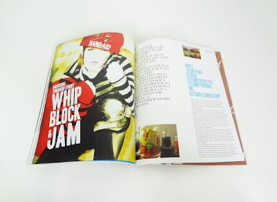
QUEEN of the RINK Throughout this research process Sam and I have had the awesome experience in researching Roller Derby Girls. We used varying methodologies and analysis techniques to do so. We began our research by interviewing different roller derby girls, attending bouts, a practice, and studying their history. Keeping visual analysis by documenting our outings helped us come to better understanding of their behavior. We created affinity diagrams explaining their values, traits, goals, and obstacles. We also created visual and verbal analysis to showcase their distinctive language and appearance. We studied the technical language of the game and the lingo/slang that is used. We needed to understand the sport in order to understand the girl. We wanted to really understand the affect that this game has on them and why it becomes such a large part of their lives. We felt that creating an image dense book would best show their attitude and passion for the sport. Sticking with a bright color palette of a reddish-pink and (s)lime green we wanted to obtain a feminine quality but we layered our spreads with a texture to rough up the feeling. We wanted to reflect the creativity of the culture but also encompass all of their bold and eclectic attitudes. 

4.12.11

Design Intervention: FINAL THOUGHTS

what we learned 
-We always consider the audience, but in the this case we had a very specific audience. We had to keep in mind how the graphics and the word usage would impact this specific audience. We considered the costs of production. We decided to make things that would be easy to mass produce and get out to the public such as our postcards and fliers. Those are simple things that can be easily distributed. In our situation we also had to really break down the communication model in order to help us be more specific in the direction that we decided to go. 

3 thing to expand
1. We would make a book (short, staple bound) that includes info on what to do instead of cashing checks. We want expand on the campaign in what our audience should do next. Come full circle with the campaign and have specific steps that would work for people in their speicific situations.
2. Specifically tailored to different situation in how to solve the problem. The next step.  Giving the next step, the answer in the ways that we have already done, billboards, fliers, etc.
3. See the results, actually displaying the fliers and giving out and sending postcards to people. "Test" out our products to get feedback from people.
4. Sending the campaign to Operation Hope to see if what we have created is a liable solution.                                                  

Operation Hope Keynote

For Consideration

We strategically thought of a solution that works with an already established organization.  We wanted to illustrate a solution that could actually be implemented and used.


18.11.11

LOGO BUILD: FINAL


digital story board

what I learned
Throughout this process I really enjoyed working with Karen and talking to her about her branding ideas. I learned that there are often these moments that one (Karen and I) had when these "light bulbs" went off. Meaning I (possibly her as well) would have a realization and of certain aspects. Such as I was really working with the timing of when PEAK should appear and I went to talk to her she said that the brand is read "405 PEAK" all at once which clarified something that I was making complicated much more simple. I also learned that I enjoy this quick way of animation. It is like challenge to see how affective I could make the information given to me work together in such a short amount of time. I am also glad that my original idea of pouring the wine came together. I was not sure how I was going to complete it, but I learned how to mask a video which created the exact look I wanted to achieve. Along with that I had to edit the color a lot on my video. I found that you can do some amazing things with color adjustments in After Effects.  Being able to manipulate the wine color was a challenge at first because I was not sure how to take it from the dark dark red (looked black) to a red maroon wine color. After doing this I have a lot of ideas brewing in my mind of things I want to do next. I think it is kind of amazing to see that I learned all of this from creating a 5 second logo build. 

To see Karen's final 405 PEAK brand book click here. 

10.12.10

Taxonomy Book

In making our taxonomy books we decided to categorize our marks by nature vs. manmade. We thought it was the best way to describe our poem being that our haiku is about this struggle between this person's  umbrella with the blowing winter rain. We liked the idea of using screw posts with a more soft paper to show this manmade with the nature. We used a french fold method, which worked out nicely with the screw posts we wanted to use.  We decided to title our book "the umbrella vs. the wind" it is this struggle between the two, but we decided to use our marks in a more playful manner. Going with a more storybook feel, making our text big and using lowercase letters to portray a children's story book. I thought about the books used to teach children shapes when they are young, and our book some what symbolizes that idea. We have marks going into the margin, and going off the page, so the marks are bold and obvious, but in most cases just using that one word to explain the mark. (plopped, rolled, stomped, ect.) I am pleased with our end product. I was nervous that the screw posts were going to be to loose, but they fit perfectly in our book. 


Final Statement

This project has been such a process. We explored so many aspects of design. Starting by using non traditional tools  to create marks, turning these marks to create a visual motif representing our haiku poem, and then taking those symbols and creating a relationship between the the three by using motion. 
windy winter rain
my big silly umbrella 
tries walking backwards 

 Beginning this entire process by picking a single poem was pretty interesting. Working in partners we chose a poem that could be read in many different ways. I took this poem in a more silly way. This struggle and awkward situation of when your umbrella decides to blow away from you or walking down the street in the gross rain with a big umbrella. My partner, David, took the poem in a more confrontational or more of the struggle between the the person and his/her umbrella. After choosing this poem we were assigned to choose objects that related to our haiku poem. We decided on objects from natural to represent the winter as well as objects such as the umbrella and shoes.  
  After we made these marks it was then when we had to try to create thumbnails that were drawn previously relating to our poem. This was probably one of the most difficult steps. Trying to find certain shapes in a mass of marks and digging through them like a scavenger hunt. Then taking an analog method to create our motifs and scanning them in. i really liked my end product of my motifs. I also learned that even when having something good, doesn't mean it always works. I created two different little "men" with their umbrella for my haiku, in which one was very beautiful, but that didn't go with this quirkiness of my haiku. I ended up going with a short little man as I refer to him, with shorter legs and kind of crazy arms and a big umbrella. This motif represented my poem best and went with my other motifs most successfully. 
  Little did I know that these motifs would be turning into a motion graphic. Using Flash was the most challenging part for me. I get frustrated when I know nothing about something and having specific ways putting the motifs together made the task even harder. I discovered that Flash is one of the those programs were you must just sit down and work on it and work on it, down the road I figured things out. I got a lot of help from my classmates (which I am very thankful for!) and I conquered a difficult task for myself. I appreciate my final video that much more now.
  This project really embodied once again all of the process and outcomes a designer can obtain with just one idea. Taking this one poem and turning it into a motion video and creating a book out of all of our marks. I think it was a good project that embodied all of what we have learned so far this year from our other projects. Using our visual communication knowledge to create a visually pleasing and interesting sequence of shapes to tell a story. 


Motif Animation
?
(i am still going to continue to upload my animation, hopefully it works soon!)

This leaves the shadows behind... which should not be there! But this is my motif animation. I hope the SWF file I leave (Jamie) has the text in the correct typeface! It is correct on here hopefully, so I am sorry if that happens again. I don't know what happened or where the problem was. I unfortunately found music to include with my animation, but itunes would not allow... the song I found was a jazz song, to put off the feeling of this playfulness. Having the rain and umbrella in this that  situation sounded like a bit of a fast paced jazz song to me. A song called I'll Remember April  I found, I think would have worked out well!

9.12.10

Linear Development


A more critical critique...

Choosing my Dot Book to critique is not really something I wanted to do, but I know it is good to go back and learn from your mistakes. I believe this has probably been my least successful project in VisCom this semester. I was really just unhappy with the finished product. I wish that the craft would have been better. I know that the potential was there, but it didn't come across that way. It is also just upsetting when you work so hard on a product and one thing can ruin it all. The binding and cover are the first things a viewer sees and those are the worst parts. I know that some of my imagery could have been better as well, but I did like my overall concept. It challenged me and yet I still had the freedom to be really creative and "me" in my imagery.
I liked my title, but the way I constructed my cover
 did not work with wire-o binding.  


Semester Reflection

   I can't even begin to start to explain the things that I have learned this semester. I feel as if I have been designing for a year already just by the things I have learned and all of the information and knowledge I have gained. Even though this semester seems like it flew by,  I think there a key parts to each project for me that will stick with me. I decided to discuss each project, I think this should help to organize my thoughts better.
   In our first project, the Dot Book, I took away that even with the most simple shape, such as a circle, you can communicate almost any emotion or word if really work at it. With this being my first big project as a designer, I was really excited that the end product was going to be a book. I also was thankful for the simpleness, being new to design. Little did I know how the placement of dots could reveal an entire story. I quickly learned the idea of communication visually, as well as all of the communication as a class and with my teachers which was something pretty new for me. The teacher and class critiques on every single step of the project was a process that helped me work through this project.  The word iteration also stuck with me throughout this project.  I know that the first 4-5 ideas or thumbnails might not be the final product. As I know and often hear, graphic design is always changing and so is the process of creating a design.


     The Kansas City posters were our second project, and I was honestly really nervous about this project. With the final project being a poster. Creating something poster like was unknown territory for me. The process was very similar to our dot book project, but the concept of juxtaposition was key for these posters. I liked how involving so many different processes came together to create a single product. A photograph, a line study, and typography coming together to make a clean and thoughtful poster. I would say the two things from this project that will stick with me would be digital craft, and that not everything can be created on the computer! Beautiful lines, and shapes are all around us and I will keep this in mind as I continue my work. Jamie also pushed my digital craft, especially on my Downtown poster with the skyline. Individually going over each line of my line study with the pen tool to have the line be smooth and flow together. I was really proud of my end product and what I accomplished. I was happy that my concept stuck throughout the critiques and over time just became more clear and clean(digital craft).


    The motif project was all of the visual communication that we have learned so far coming together. Creating shapes out of analog method combined with text and in the end creating a flash video out of our motifs to portray our haiku poem. whew! I think this project taught me all of the things that you can do to communicate an idea or story. Once again using an analog method to create our project. Taking our analog marks and using them digitally. I think this is a good outlet for me. I have yet to master creating everything on the computer, but I know how to use paint, scissors, glue, objects, and a scanner to get a product. I love how that is a part of design that I don't think many people realize. To be able to incorporate these methods that have nothing to do with a computer. Combining type and digital methods, I get the best of both worlds!

    The knowledge I will carry to next semester, is probably everything I have learned this semester! I feel like I kind of started from "scratch" but I do think it is amazing the things I am beginning to understand and learn everyday.  I really appreciate the professionalism I have learned this year and how to incorporate that into my work as well. The passion that Jamie, Marty, and Kelly have has definitely rubbed off on me.
Thank you!