
Showing posts with label Typography 3. Show all posts
Showing posts with label Typography 3. Show all posts
18.11.11
TYPEFACE: update
This is the first round my taking my typeface Hem and combining it with imagery to create the digital booklet. I still have a lot of digital craft to work on in the typeface as well within my imagery and compositions. This will be in digital format so clarity and proportions become very important. I am still coming up with appropriate type applications: t-shirts, bags, storefront, cards, etc.


2.11.11
FONTSTRUCT TIME, inspiration
I want to create a typeface that eludes a clean, fresh, and quirky feeling. I want to create a lowercase alphabet that use ball end terminals as well as having a thin stroke and weight.
Inspiration:


I think if my typeface (or what I can see my typeface looking like at this point) where a person, it might look like these girls.
GOAL: To create a typeface that could represent or be paired with all of the imagery I have included…
Inspiration:


 | |||||||||||||||
GOAL: To create a typeface that could represent or be paired with all of the imagery I have included…
1.11.11
KOENIG: FINAL
Koenig Final
In my Pierre Koenig book I wanted to showcase the features in his architecture. The highly geometric minimalism that it exudes. I did so with blocks of color masks over top of the imagery. The retro feel of his architecture inspired the warm colors of the overlapped shapes. My grid was derived from the simplicity of his architecture and the shapes that are formed from the beams and steal bars used.
In my Pierre Koenig book I wanted to showcase the features in his architecture. The highly geometric minimalism that it exudes. I did so with blocks of color masks over top of the imagery. The retro feel of his architecture inspired the warm colors of the overlapped shapes. My grid was derived from the simplicity of his architecture and the shapes that are formed from the beams and steal bars used.
17.10.11
KOENIG: Spreads, starting to add more color


These are the spreads I have been working on. I am incorporating color into the image that interacts with the text. During critique we brought up the point that the color blocks could become to much. Which I agree with after seeing the images on the spread the color is starting to take away from the image itself when it should be helping the image and text come together. I still need to work on footnotes, adding some text wrap, and just making sure that I stay consistent through my titles, subtitles, type.
3.10.11
KOENIG: Spreads, Round 1
1) I decided on using Avenir as my typeface, but it needs a more contrast throughout the spread. (contrast, contrast, more contrast!)
2) This body text was a little dense, so it got vetoed.
3) This was the most successful layout for now. It's not perfect yet, but I am going to combine spreads 1 and 2.
 |
| Avenir |
 |
| Myraid Pro |
 |
| Grotesque |
COMBINING TYPEFACE// four tips… creating contrast!
Four Techniques for Combining Typefaces:
wit, energy, poise, and dignity.
wit, energy, poise, and dignity.

I like the idea that they use of finding different moods.
So taking a typefaces that have different personality and mixing them together

I also enjoyed their take on just taking typefaces from the same period,
but using families that have different personalities.
As well as using the same designer of typefaces and mixing those to gain contrast


Using different typefaces with the same weights but that are
used to represent different hierarchy.
23.9.11
GERTRUDE STEIN'S TENDER BUTTONS, Final Thoughts
DIGITAL
 |
| whole spread |
 |
| back + colophon |
 |
| colophon section |
 |
| close up |
PHOTOS


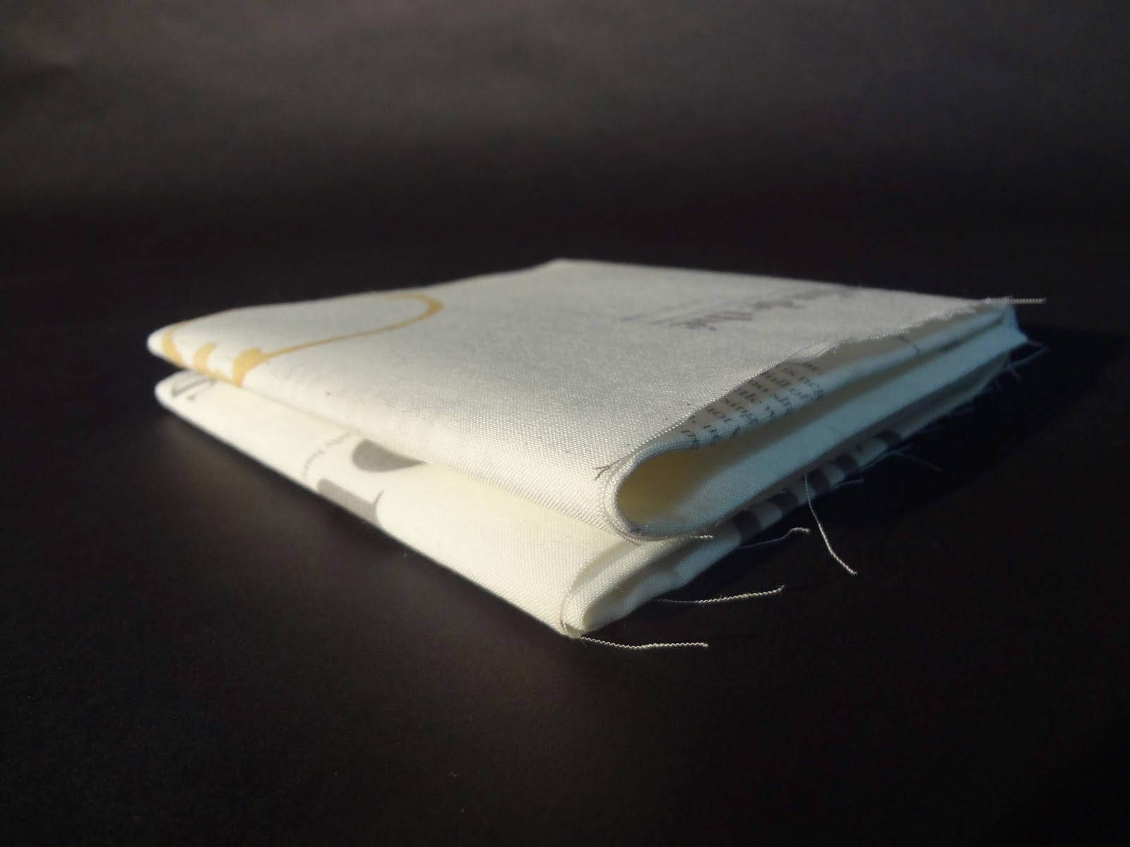


After working on this type project I have learned that through typography I can show and tell a story without imagery or color. Just the composition of the typography and the subject matter it is portraying can be enough to get your concept across. I derived my concept from a personal experience. I wanted people to see the moments and things that I saw. I had tea in a tea garden while in Paris and I wanted to show the repetition and somewhat randomness that is Gertrude Stein's poetry through my adventure. Tender Button's is broken up into sections: Food, Objects, and Rooms. The way she uses repetition in her poetry and it's rhythm reminded me of tea cups, saucers, and pots all over the table in their unorganized way.
CLASS DELIVERABLE>> For my anthology of Gertrude Stein's Tender Button's I wanted to recreate an experience that I had while in a tea garden. I noticed the poems Cup and Saucer, Table, Cloth, and Cream from the categories Objects and Food. These poems reminded me of an encounter I had while having tea. The repetition of her words within the poems started appearing like the cups and pots scattered around the table. I decided to create a composition of all of my poems into one. I wanted to turn my book into one large fold out that the viewer would unfold creating a table cloth. The poems represent all of these objects and food out on the table. I printed on fabric so the experience is more realistic in the way that it feels and looks. I named my anthology Jardin de Thé or Tea Garden in French. My adventure is related in a similar situation to Stein’s. She was in Paris for most of her life and my tea garden experience happened for me in Paris as well.
Subscribe to:
Posts (Atom)