Ad Adjust the cropping and orientation of the dot/type in relation to the page edge. A real mock-up of the ad, photographed in context, will be more convincing. Plus you can shoot it so the article on the right side garners less attention.
Card The new image is great. Crop in so the image doesn't leave that black line on the right. Work on the postcard back. How can the typography be more refined and feel consistent with the front?


Ad
ReplyDeleteAdjust the cropping and orientation of the dot/type in relation to the page edge. A real mock-up of the ad, photographed in context, will be more convincing. Plus you can shoot it so the article on the right side garners less attention.
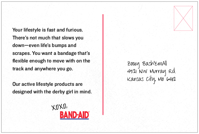
Card
The new image is great. Crop in so the image doesn't leave that black line on the right. Work on the postcard back. How can the typography be more refined and feel consistent with the front?
Button is good addition.