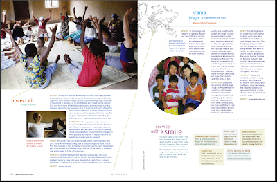
-I chose to look through a magazine that I have always noticed as having good layout design. Yoga Journal is clean lined and simple which reflects the subject of the magazine as well.
I believe these second two pages use a five column grid. It caught my eye because of the pictures and how the text wraps and flows with the pictures they are not clashing in anyway. I think that was one difficult element of creating a page layout for me. Trying to incorporate pictures and not having them floating in the space or look so stuck in without a purpose. The text wraps around the picture in the fourth page just right and I like how the pictures bleed off the page. Each page uses text and photographs in different ways which keeps the viewer interested and the eye has a lot to look at but it is not overstimulating or to busy. The use of color is relaxing and contrasts well with the background an flows with the photographs. Also, on the first page, there are multiple typefaces being used, which for me is sometime hard to do. To step out of the box of using the same typeface and using a variety of weights to give variation which can create a unique composition.
Here are some more pages I found that caught me eye. I find all of these very visually interesting through the type and image. Also the color of the type makes the page even more diverse and also helps the use of hierarchy.


that color scheme is super relaxing... I'm ready to get my stretching on.
ReplyDeleteI just looked over your whole site and I'm in love with it! I love your inspirations. Under the Color Drawing Production, I loved the pictures with objects matching the fingernail polish of the girls! You always do amazing mac!
ReplyDelete