

Clarendon caught my attention from the beginning. When looking at my w's for this project I was drawn to it's boldness. I love the shape of the counter space that the serifs produce. The heavy square of the serifs supports the weight of the vertices. The vertices produced by the the stems create a width that makes the letter form seem heavy, just resting on the baseline. The width of the stems is wide so the Clarendon type face is bold and attention grabbing.
 |
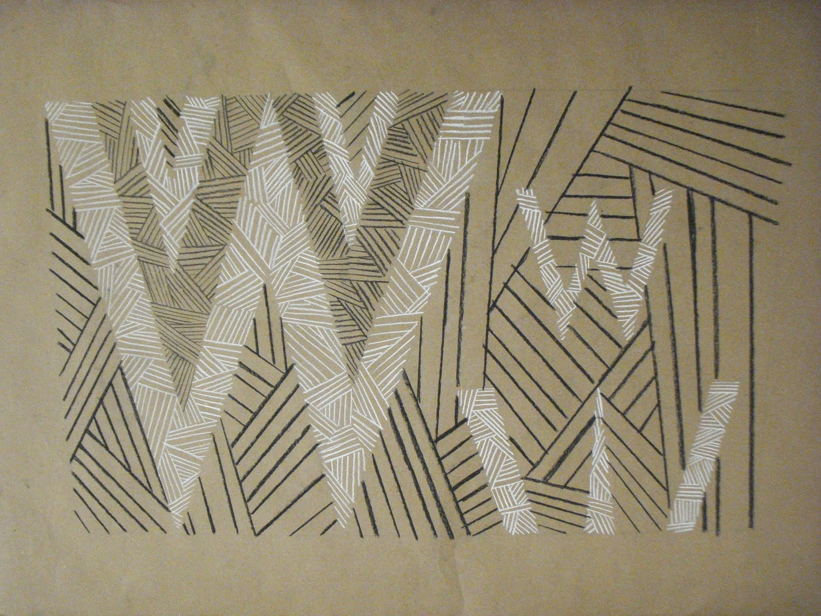
| Clarendon |
 |
 |
| Futura |
 |
| Garamond |
I love all of your work McKenzie! You are naturally gifted and talented and will no doubt go far in life.. I picked this entry to comment on because of the W's. I've always been fond of them and these also made me think of Sesame Street, when they focus on a letter for the day and you get to see it in so many different fonts and forms even animated sometimes.
ReplyDeleteKeep up the great work beautiful girl :)