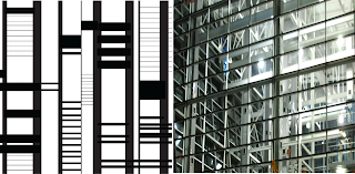
In class we went over our pairings of the Kansas City area. I am really happy with some of my pairings and now I know what I need to go back and fix. We talked about the characteristics of each area or neighborhood located in our pairings.
My Locations were the Crossroads District and the Power and Light District.
CROSSROADS
- Art District
- eclectic
- one of a kind
- creative
- vibrant
- diverse
- community
- expression
- relaxed
- unique
- opportunity
- contemporary
- artistic
- inspiration
KC POWER & LIGHT
- premier
- unique
- night-life
- epicenter
- captivating
- entertaining
- heart of downtown
- revitalized
- lively
- flashy
- renovated
- new
- alive
- modern
- clean
- simplistic lines
These characteristics will help us with our poster series based off of these ares. On these posters will include our line studies with it's photograph pairing and it will represent the area. We have to consider what we want our posters to say, graphic aspects, and make sure to include and think about the 12 principles! It will include text which is the neighborhood name. We are starting with analog sketches using collaging for our posters. So using glue, sharpie, black paper, cut out shapes, white paper, and other elements to make our sketches for our posters. I have never done a sketch this way, but I am excited I think I just need to remind myself that even though it is collage and including all of these different mediums and ideas to still be very clean and clear. The orientation, frame, scale, and contrast are elements I will be thinking about as well.
Some of my pairings....
Now I just have some cleaning up to do on my pairings after crit yesterday and on to the posters!


No comments:
Post a Comment