what we learned
-We always consider the audience, but in the this case we had a very specific audience. We had to keep in mind how the graphics and the word usage would impact this specific audience. We considered the costs of production. We decided to make things that would be easy to mass produce and get out to the public such as our postcards and fliers. Those are simple things that can be easily distributed. In our situation we also had to really break down the communication model in order to help us be more specific in the direction that we decided to go.
3 thing to expand
1. We would make a book (short, staple bound) that includes info on what to do instead of cashing checks. We want expand on the campaign in what our audience should do next. Come full circle with the campaign and have specific steps that would work for people in their speicific situations.
2. Specifically tailored to different situation in how to solve the problem. The next step. Giving the next step, the answer in the ways that we have already done, billboards, fliers, etc.
3. See the results, actually displaying the fliers and giving out and sending postcards to people. "Test" out our products to get feedback from people.
4. Sending the campaign to Operation Hope to see if what we have created is a liable solution.
Operation Hope Keynote
For Consideration
We strategically thought of a solution that works with an already established organization. We wanted to illustrate a solution that could actually be implemented and used.
Showing posts with label Visual Langauge. Show all posts
4.12.11
Design Intervention: FINAL THOUGHTS
30.11.11
Design Intervention, keynote
20.11.11
Design Intervention, 2nd round
After our group critique we needed to create a more specific campaign that has a specific message. Since we wanted to keep the focus on the idea of changing the way people think and how they make their choices. We wanted to make the context more targeted to this idea of long and short term. We decided on the idea of cashing checks. We discovered that a lot of people don't realize the long term affects of cashing checks and quickly the money that they take out of the check can add up.
6.11.11
PROJECT 3: design intervention
We just began our third and final project for this semester in Visual Language. We are creating a proposal for a design intervention that addressees a systematic issue surrounding poverty. As a junior class we took part in a poverty simulation so that we might get more inside knowledge and understanding of this issue.
Patrick, my partner, and I came up with these proposals.
1.11.11
24.10.11
PACKAGING: FINAL
FINAL THOUGHTS
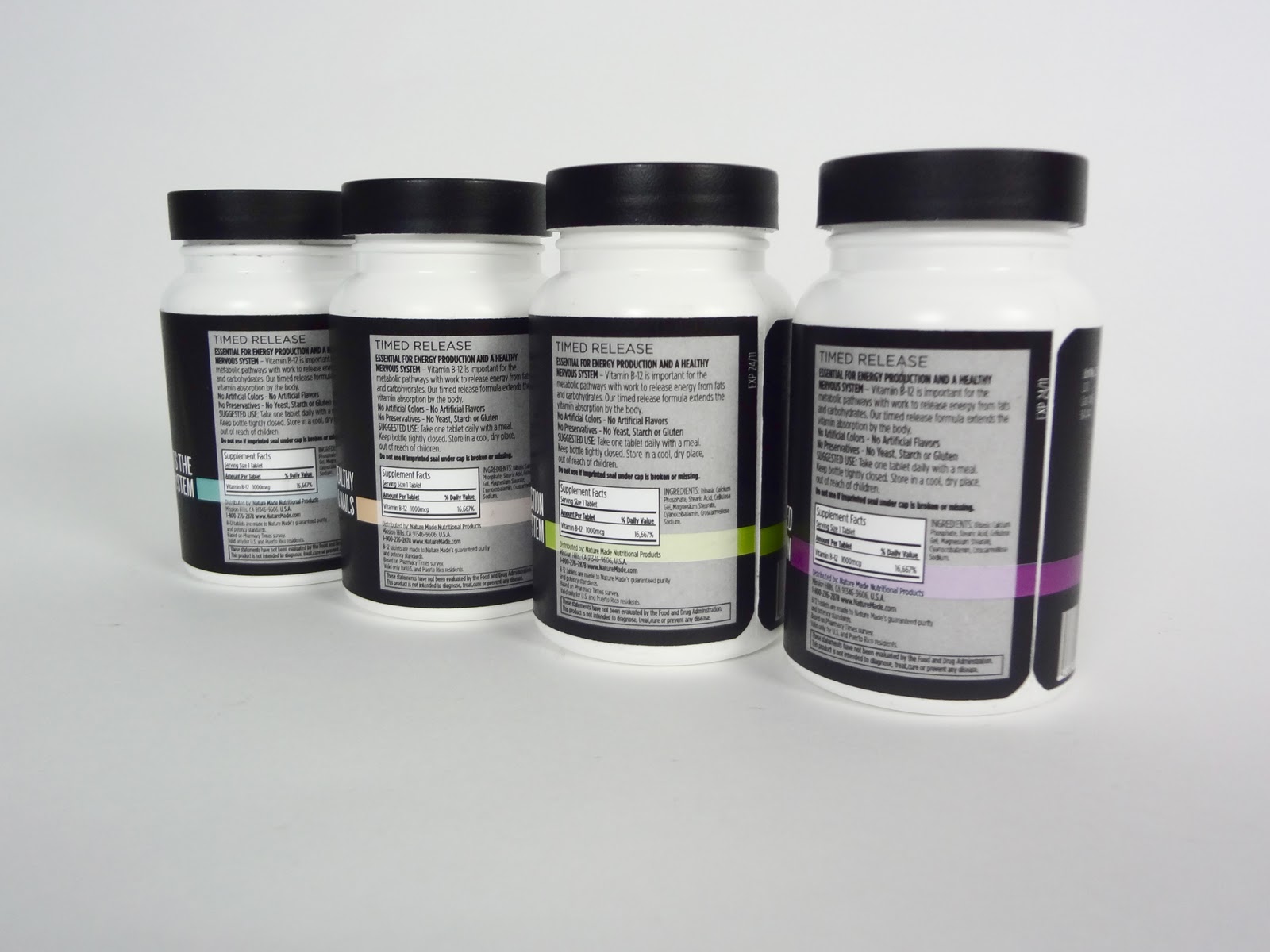
my concept- Minimizing the information on Nature Made vitamins bottles to only the necessary information by taking the package from ethos to logos.
I have learned a lot through this project not just about packaging design, but also through aspects of business, advertising, and basic design theory. When redesigning packaging the audience plays a large roll in your design. Who will be buying this product? I found that I needed to narrow that down with my packaging system. I wanted to target most likely 30-50 year old's who are familiar with vitamins and know what they want. I also looked at it though as if a person who was new to vitamin world and how my packaging would catch their eye over another vitamin package. My bottles stand out on the shelf and have a very minimal approach through the text. I wanted to keep only the needed wording and title on the front and have the rest of the information on the back. I created a color palette and used small icons to represent that specific vitamin. The vitamins have a more sophisticated look and do not have the different color block sections, colors, and type all over them like the original packaging does. I did take authority in changing the logo. To obtain the outcome that I did, the logo was not going to be able to work. All I did was make the Nature Made logo white along with the leaves.
In the beginning digital stages I struggled with making the type interesting. Even though I don't have a lot of sides to my packaging or type to work with- getting the minimal type I had to be striking and to stand out was the most difficult part. Once I figured out a type lock up that worked, creating the designs for the other vitamins was easier to approach.
Though I don't know if my packaging is fully practical for a company (I am sure I am breaking some sort of code here or there, the original has a website, some emblems and what not on it.) but as a designer it is my job to be able to design for the better of a product. I would be interested to know or see if I could sell my vitamins or if people would be more likely to pick them up?
12.10.11
VITAMINS: labels in color
These are my variations for the B-12 Vitamin Label. I want to make it a series to show what other vitamins would look like as well so I also added the Multi Daily Vitamin, Iron, Fish Oil as well to start showing what some possibilities could be for the other vitamins.
VITAMINS: first digital sketches
Subscribe to:
Posts (Atom)